POSTED ON 16 JAN 2020
READING TIME: 9 MINUTES
Applying analytics and data science in telecoms - network congestion forecasting
In the epilogue to “As You Like It” Shakespeare wrote, “If it be true that good wine needs no advertisement, ‘tis true that a good play needs no epilogue; yet good advertisement adds to the popularity of good wine, and good plays prove the better by the help of good epilogues.” Following in his footsteps this blog intends to give a ‘good advertisement’ to the work being done at Sonalake in the field of data analytics for telecom service providers (telcos).
The telecoms industry, with its huge volumes of rich data, presents a ripe target for advanced analytics. As we combine deep telecoms domain knowledge with a breadth of experience building analytics software across verticals, it's a great space for us to pitch in with our expertise. It also presents an opportunity to leverage our VisiMetrix™ executive dashboard solution that is already deployed within several telcos.
In this series of posts, I will describe some of the research areas we are exploring at Sonalake. For the first post, we will concentrate on congestion forecasting.
The challenge
Network congestion is a widespread problem for telcos as it diminishes quality of service (QoS) for users. Telcos monitor congestion round the clock in an effort to highlight QoS issues so that they can be addressed promptly. They also preemptively address issues where they can, but the tools to flag such issues are limited. Most of them rely on guesswork of experienced operators and to our knowledge a completely automated solution does not exist.
We recently partnered with Vodafone Ireland to determine if we could help automatically predict 4G congestion with a view to:
- Help determine where network investment can have the greatest impact
- Cell congestion issues impact operational costs and they are keen to upgrade only where necessary due to cost involved
- With increasing data volume and the introduction of 5G, more sophisticated and automated methods to predict congestion are clearly needed
Before we partnered, Vodafone used cell-based KPIs with predefined thresholds. Using this information about threshold breaching, they were able to determine congested cells across the network. The graph below shows the KPIs and their thresholds for a cell.
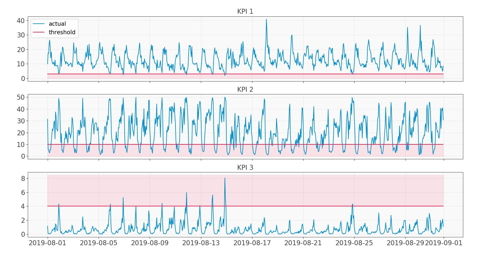
Fig 1: KPIs with thresholds
So, ours was a two-pronged problem:
- Firstly, we needed to predict these KPIs for all the cells in their entire 4G network, covering many thousands of cells across Ireland
- Secondly, we had to find a way to combine the congestion from all three KPIs and rank cells from the most to least congested
Divide and conquer
Coming to the first problem, the challenge was to come up with a KPI-agnostic method to predict each of the KPIs. This need arises from the fact that though we were predicting congestion for 4G network, our long term goal is to extend this method to 5G and other new KPIs. To this end, we used a decomposition technique and attuned it to telecoms data. This involved experimenting with many techniques and creating methods to automate finding the right parameters for decomposition which otherwise are handcrafted. Though it was applied to the three KPIs shown above, we did try it on several other typical telecoms KPIs and found its results satisfactory. This method decomposes a KPI into seasonal, trend and noise components as shown in the following graphs. The seasonal component is the periodic daily or weekly pattern that repeats itself. The trend is the overall level of the time-series (or signal) and noise (or remainder), as the name suggests, is the random component of the signal.
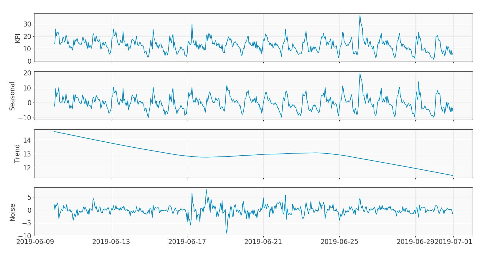
Fig 2: Decomposition
At first sight, decomposition seems to aggravate the problem as it adds new components to our model. But it simplifies prediction as we have separated various underlying processes into components which are easier to predict.
We then set about predicting each of these components separately. We attempted a variety of techniques ranging from neural networks to time-series forecasting, as well as developing our own custom methods for some components. We then took the most accurate methods for the entire network.
The graph below shows how we predict each signal component for a cell separately using the method best suited to each, and add them together to get the predicted KPI.
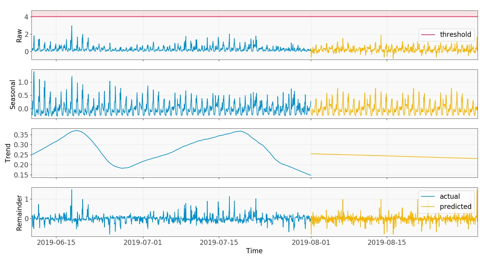
Fig 3: Predicting each component separately
Some of the methods used for prediction performed poorly when averaged across the whole network but were accurate when dealing with congested cells. Therefore, they might be useful in the future to further refine our predictions.
Double, double toil and trouble!
Having predicted the KPIs we could readily determine the number of threshold breaches. But the story got more complex here, awaiting us was the arduous task of combining these breaches for the three KPIs.
From here we had to identify a measure that:
- Combines the congestion in the three KPIs in a way that allows them to be ranked
- The error introduced by it should either be miniscule as compared to the error in prediction or it should mitigate that error
After a great deal of work, we fashioned the silver bullet for both these problems. The measure segregated non-congested cells from the congested ones, and not only that, it was also KPI agnostic and could include any number of KPIs.
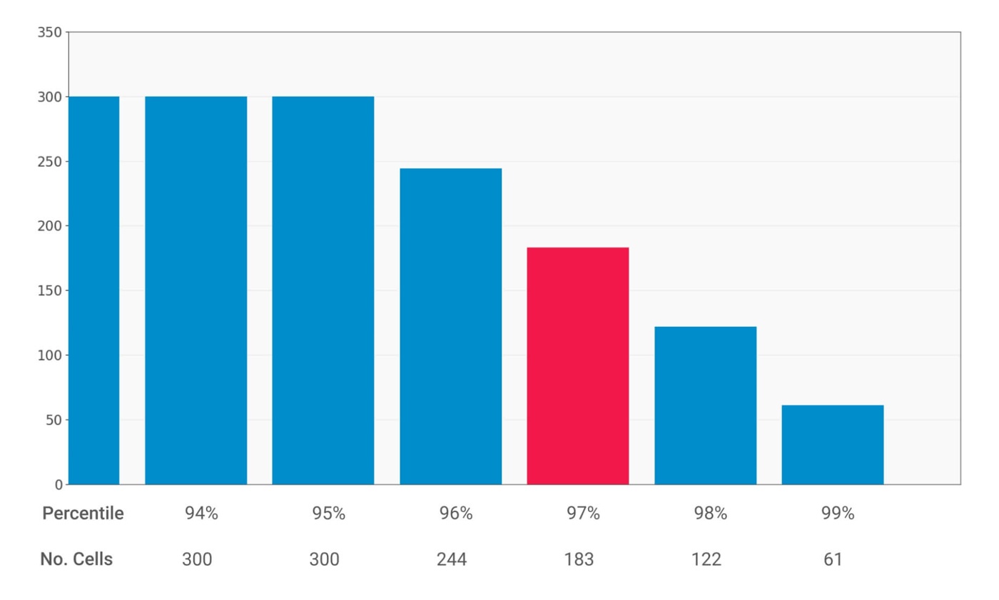
Fig 4: Percentile scores histogram
Finally, to rank the cells from most to least congested, percentile scores of this measure were used. The histogram above shows the percentile and number of cells above each percentile, we chose 97 percentile cut-off and as such, 183 cells from the whole 4G network were congested. Similarly, we could set different cut-offs for the percentile scores and categorize the cells above a certain score as congested (e.g., if we set the cut-off at 98th percentile we get 122 congested cells).
When the hurlyburly’s done
Once we had our predictions and ranking measure sorted, we started the task of measuring accuracy. This is complicated because not only does it change with the percentile cut-off, but also there are two kinds of errors that affect accuracy:
- Errors in prediction when compared to the actual
- Errors in ranking measure
We separately analysed both of these errors but with similar methodology. For the first one, at each percentile cut-off we chose the following accuracy measure:
[latex]accuracy = 100 * \frac{no.\ of\ cells\ common\ to\ both\ predicted\ and\ actual\ congested\ list}{no.\ of\ cells\ in\ predicted\ congested\ list}[/latex] [/fusion_text][fusion_separator style_type="default" hide_on_mobile="small-visibility,medium-visibility,large-visibility" class="" id="" sep_color="#ffffff" top_margin="25px" bottom_margin="" border_size="0" icon="" icon_circle="" icon_circle_color="" width="" alignment="center" /][fusion_text]
The measure takes into account the difference between the predicted list of congested cells and the same list but from the actual data observed over the same time period. The histogram below shows the accuracy for different cut-offs:
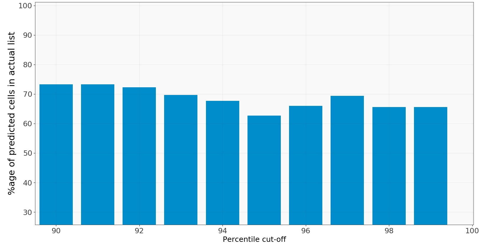
Fig 5: Accuracy histogram predicted vs. actual
At 96th percentile we have around 70% accuracy and it stays between 60-70 for most percentile values. This gives a measure to our prediction accuracy which is about 70% and quantifies the first kind of error giving us an idea about how accurate the methods we used are to predict each of the three components: seasonal, trend and remainder.
Secondly, to calculate the error in ranking measure, we separated it from the prediction error by relying on Vodafone’s congested cells list. They compiled this list at the end of every month from the actual data. To compare our ranking measure to their list we tweaked our accuracy parameter to:
[latex]accuracy = 100 * \frac{no.\ of\ cells\ common\ to\ both\ actual\ and\ Vodafone's\ congested\ list}{no.\ of\ cells\ in\ actual\ congested\ list}[/latex] [/fusion_text][fusion_separator style_type="default" hide_on_mobile="small-visibility,medium-visibility,large-visibility" class="" id="" sep_color="#ffffff" top_margin="25px" bottom_margin="" border_size="0" icon="" icon_circle="" icon_circle_color="" width="" alignment="center" /][fusion_text]
It is similar to the formula before, but now we use the cells common to the congested cells list and the one from Vodafone’s way to calculate congestion both using actual data from the same time period. Using the actual data for both these lists we remove the error introduced by prediction and hence the accuracy now only relates to the error in our ranking measure.
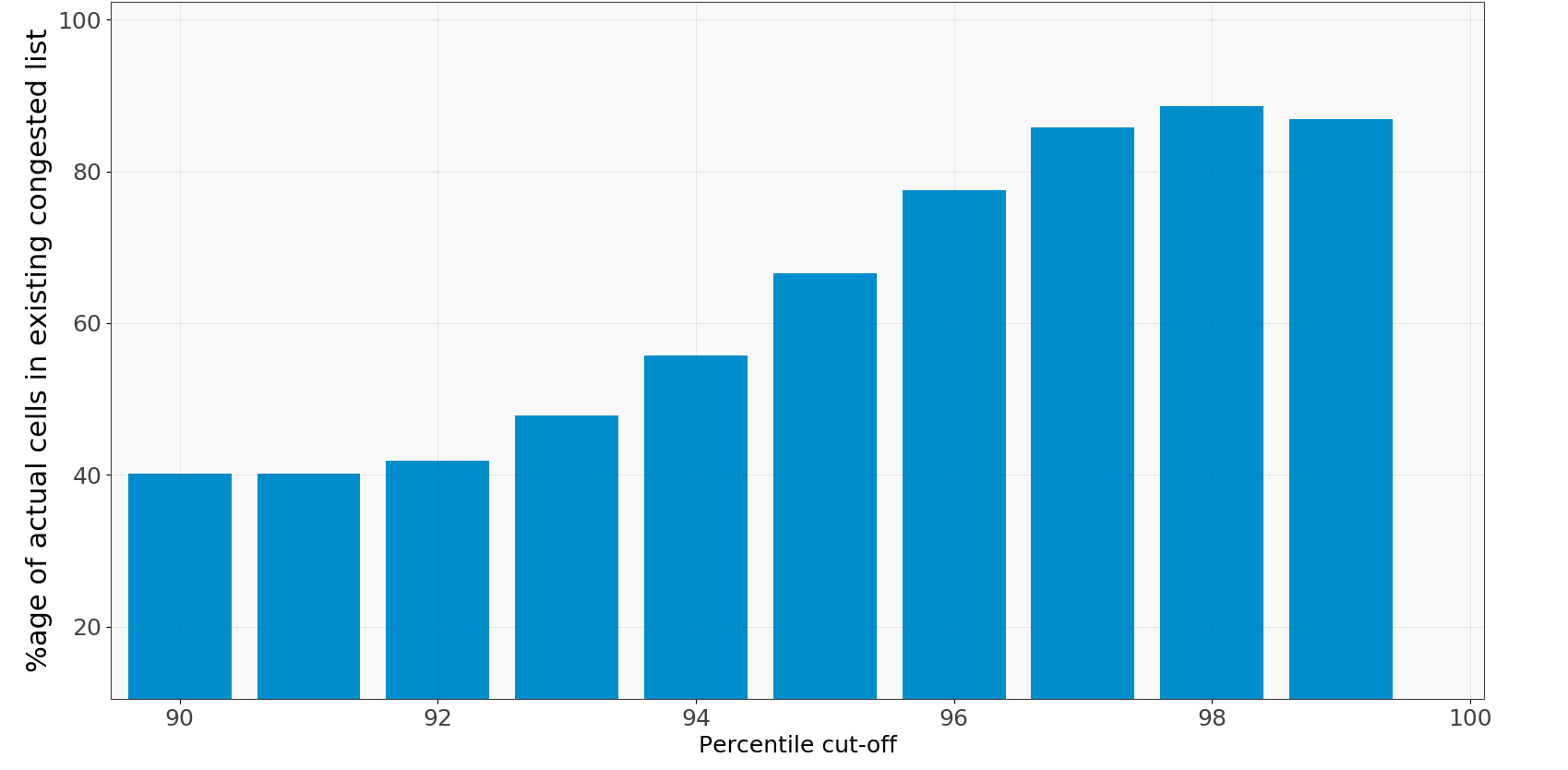
Fig 6: Accuracy histogram actual vs. existing
Our results are shown in the histogram alongside, where we get an accuracy of about 88% at the 98th percentile. This proved the effectiveness of our ranking method.
Having dealt with both the errors separately we were ready to test our results. For the accuracy it was changed to:
[latex]accuracy = 100 * \frac{no.\ of\ cells\ common\ to\ both\ predicted\ and\ Vodafone's\ congested\ list}{no.\ of\ cells\ in\ predicted\ congested\ list}[/latex] [/fusion_text][fusion_separator style_type="default" hide_on_mobile="small-visibility,medium-visibility,large-visibility" class="" id="" sep_color="#ffffff" top_margin="25px" bottom_margin="" border_size="0" icon="" icon_circle="" icon_circle_color="" width="" alignment="center" /][fusion_text]
We use the overlap between the predicted congested cell list and Vodafone’s congested cell list as a measure of the accuracy of our approach. The rationale behind it being, when put to practice we want to see how our predictions compared to the existing method, thereby, predicting the cells correctly before they get congested. The percentage of cells that appear in both our predicted congested cell list and Vodafone’s congested cell list includes prediction error and ranking error.
And the battle’s lost and won!
Fig 7: Accuracy histogram predicted vs. existing
The results did not disappoint. We achieved 87% accuracy for the 97th percentile and around 90% for the 99th percentile, with levels falling to around 50% at lower cut-off percentiles. These lower accuracies are of little concern here as we are only interested in highly congested cells which are mostly above the 95th percentile. Also, it is only practical to look at a couple of hundred congested cells, most of which are typically found at 97/98th percentile.
In future, we plan to fine-tune our prediction methods by using more computationally expensive algorithms like neural networks on selected set of congested cells to improve accuracy. Making an interactive User Interface that couples these insights with geographical location of the cells and gives the ability to choose different algorithms and thresholds is also on our to-do list. In the future, we see this tool being used in conjunction with data related to revenue and configuration management providing actionable insights across different areas.
This concludes our journey in the domain of congestion forecasting for telecoms. In the upcoming articles we will touch upon anomaly detection and relationships between alarms/KPIs. Feel free to write to us if you have questions or suggestions and, stay tuned!