POSTED ON 23 OCT 2018
READING TIME: 6 MINUTES
VisiMetrix™ for network intelligence - the story evolves with new features delivered


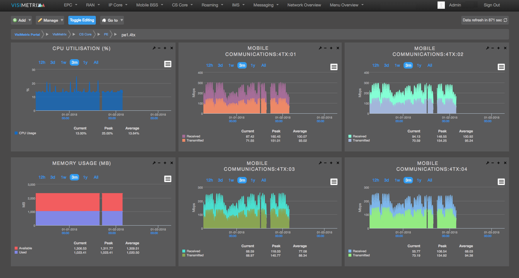
VisiMetrix™ is an executive dashboard solution focused on the telecom service provider industry, designed to share near real-time network intelligence across multiple user groups within the organisation. It combines network performance visualisation, monitoring and analytics on a single platform, enabling end-to-end service management.
VisiMetrix™ is constantly evolving based on new research and innovation as well as valuable customer feedback as we introduce new features. This short post will give you a flavour of some of the new developments that we have delivered to market in recent times.
Service Health Score - executive dashboard view
Despite having access to all manner of KPIs across network and business systems, the most consistent problem that we hear executives articulate is that they still can’t get the information they are looking for when they need it.
In the rush to solve this problem, solutions tend to offer more information over a wider range of sources. From listening to our customers, we’ve concluded, counter-intuitively, that executives actually need to see less detail on the things that really matter, but in a very accessible format. The result is a very clean and simple service view that achieves this objective.

By working very closely with a number of VisiMetrix™ users, we have built a new category of executive dashboard that allows users to group diverse KPIs and counters together into a single combined measure that we've called a "Health Score". This health score is representative of the health of a node (e.g. combining server specific metrics) or of a service (combining all relevant KPIs of the component parts of the service).
This new health score index allows the user to keep an eye on the current status of the service, view its history and be alerted should the health score rise or fall beyond predefined values. Standard VisiMetrix™ features and functions will continue to be available for drill through and more detailed interrogation.
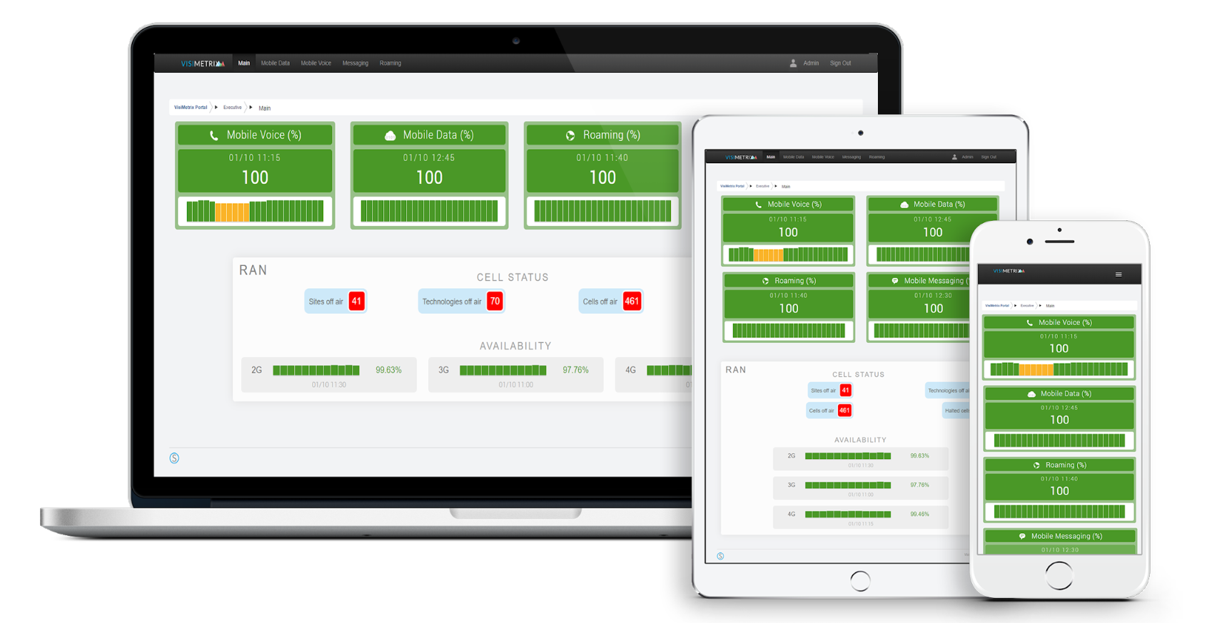
We’ve also made this dashboard fully responsive so that executives can flexibly view the data on a mobile device, providing the confidence of being up to speed on network status anyplace anytime.
Threshold improvements
The management of thresholds is a simple concept whereby a visual indicator is displayed on a dashboard to alert the user if a threshold is breached. For more complex threshold breach use cases, thresholds are composed of multi-layered variables such as time of day or deviations from a mean. VisiMetrix™ now features a threshold-setting feature that provides for more fine-grained alerts and monitoring capability.
Firstly, we’ve worked hard to improve the user interface to make the mechanics of adding, editing and removing thresholds as simple and easy as we can.
Secondly, we’ve built a new feature to allow deviation thresholds to be set and monitored. Deviation measures are different to traditional performance monitoring data sets in that they only measure the deviation from the expected value and not the measure itself. This is particularly useful for monitoring threshold breaches on fluctuating time series data which in the past have been tricky to generate alerts against as they oscillate throughout the day.
Thirdly, we’ve made some subtle changes to the way we allow thresholds to be set to cater for various use cases such as a with binary datasets or when data breaches a defined floor.
Lastly, we’re working on improving how users receive threshold breach alarms to make sure that detailed information on a breach is provided. To this end, users now receive an email alert that outlines the threshold breach, supplies the graph of the data, provides steps to troubleshoot and also provides direct links to the affected KPIs. The email content and recipient list is fully customisable within VisiMetrix™.
Geographic map changes & playthrough
When it comes to displaying data, maps can be an effective visualisation technique with certain data sets (e.g. cell status) being particularly well suited to map views. We’re continually looking to improve the user experience here and have made a number of changes recently. These include recolouring the base map layers to allow for the layers of data to be more easily viewed.
We use Google Maps to cluster data points that are located in the same geographic region. The trouble is that often this skews the summary view, where a single cell off air in a city will result in the entire city cluster of 1000’s of cell sites displaying Red which may make you think that there is a much bigger problem then there actually is. As a result we've introduced the ability to toggle on and off the clustering facility whilst as the same time providing an elegant view of the thousands of cells that are present.
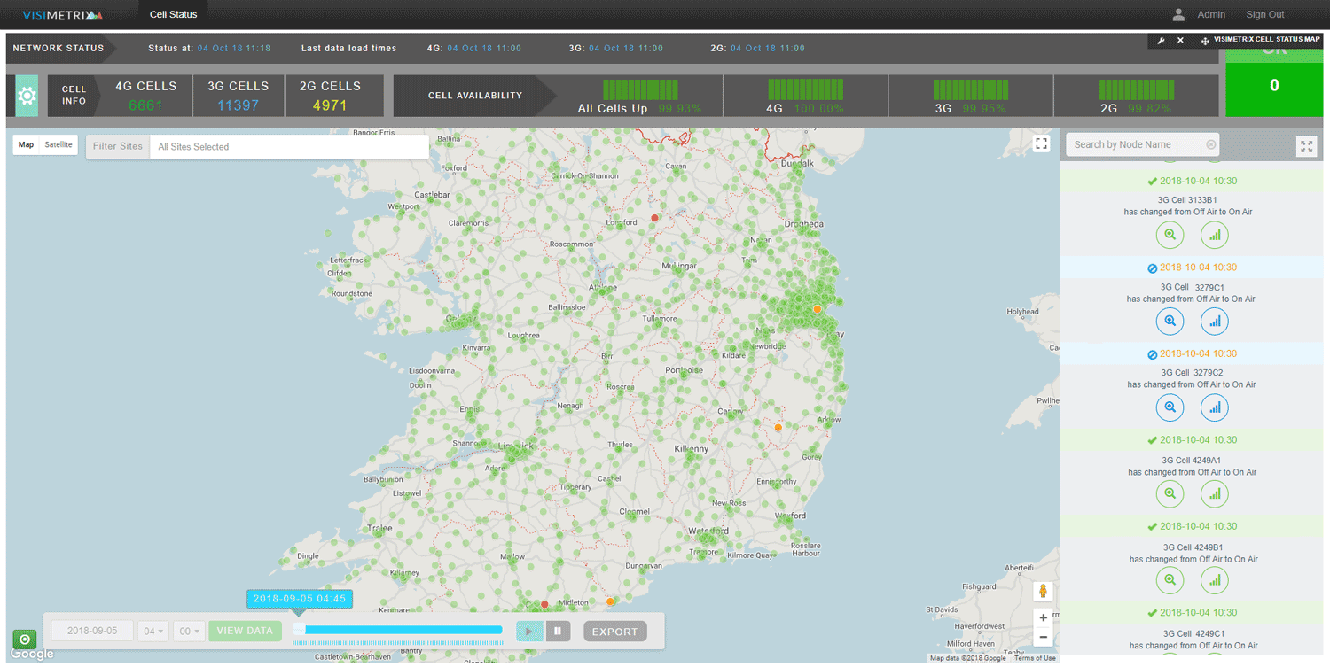
Also in map views, we have added a Playthrough feature. So as well as having a powerful way to visualise the current status of your network, you can now also visualise the changing status of the network over time in a simple and effective animation.
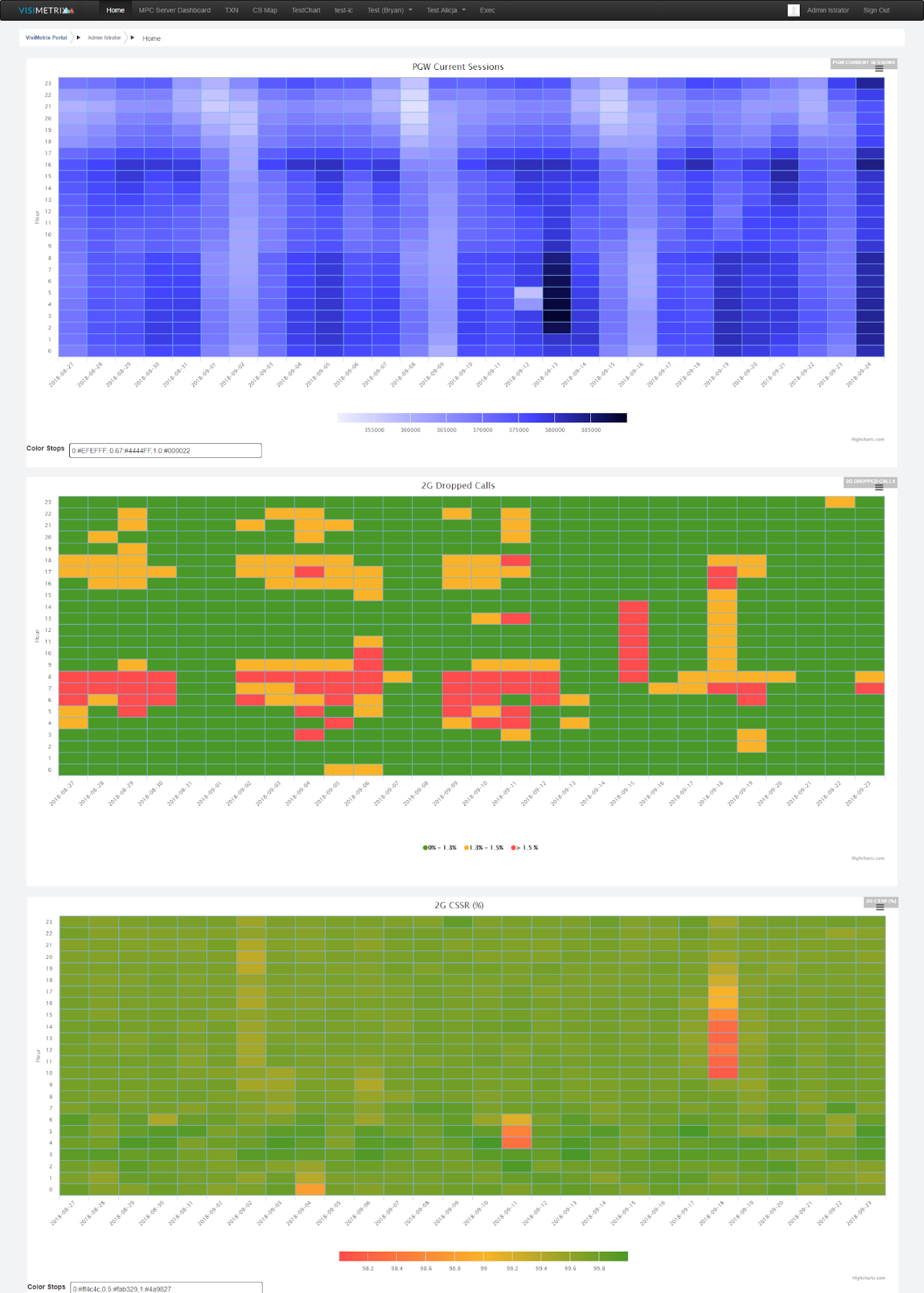
New visualisations
We constantly review and evolve the available visualisations within VisiMetrix™. We’re excited that two new visualisations are now available.
The first is a Calendar Heatmap. This is a very effective visualisation for large data sets where for example, the hourly total for a KPI can be displayed over a year or month using a grid display with colour coded thresholds. This is a fantastic visualisation to identify patterns by day or by hour depending on the shading and grouping of the data by row and column and it looks great too!
Secondly, we have combined two very popular visualisations in VisiMetrix™, namely: our TopN panel which allows you to sort nodes or entities by the current value of a KPI and our Sparkline panel which shows you at-a-glance the historical performance of a kpi or counter for a given entitiy. This new TopN Sparkline panel now shows you both the rank and the historical performance to provide a super useful current and trend view.
Other changes
- We now support the ability to add notes to charts in your dashboards.
- For those night owls among you, or for those who just prefer a more dimmed interface, VisiMetrix™ now offers a dark theme.
- Users now have the ability to add tooltips to charts and legends so that you can easily add context to help other users understand what's going on.
- VisiMetrix™ can now monitor status changes (e.g. Link Up or Link Down) in the same way as performance counters or as a combined status in an availability metric.
- Finally, we’ve implemented a new KPI search feature that allows the user to search and retrieve the metrics and graphs you need without having to trawl through the many thousands of metrics and KPIs that are monitored.
We hope this tour of new features has been of interest to you. We continue to work on our feature roadmap including adding the ability to apply machine learning techniques to anomaly detection in a future version of VisiMetrix™.