POSTED ON 23 NOV 2017
READING TIME: 9 MINUTES
UX in interactive dashboard design
A good proportion of the software we develop at Sonalake generates or processes large volumes of data. Server telemetry, IoT device activity, social media metrics, open data sources, clickstream data, content analytics - the list goes on. The sheer volume of available data can be overwhelming.
So. Much. Data. So. Much. Data. Image credit r2hox https://flic.kr/p/gdMrKi
In reality though, this is a great problem to have as this abundance of data can be used to help make better business decisions. To achieve this, and derive maximum value from the data, users must be able to make sense of it; ask questions, uncover patterns and identify anomalies. So how do we make data understandable?
One approach is to present the user with a model and data in a tool they’re familiar with in the hope they will uncover an “actionable insight”. At one end of the spectrum are general-purpose tools like Excel. At the other, are specialised open source and commercial visualisation tools. Whichever you use, getting value from them not only requires a time investment to become proficient in their use, but also a broad set of skills ranging from knowledge of the underlying data, statistical modelling, as well as analysis techniques. These are skillsets of data scientists, which unfortunately makes them rare.
These skills are absolutely required when wrangling data and designing dashboards but crucially, they don’t account for how that data will be consumed by users. Hopefully more people are going to consume, or "read", your dashboards than are going to create them.
Being able to communicate through visualisation to someone who doesn't speak the same technical jargon is one of the big challenges when designing dashboards for a decision maker. People need to see what you're seeing without the distraction of extra features and that's where a lot of visualisation crashes and burns. When we use too many colours, too many shapes, too many patterns, and too much data, the visualisation is almost like a jungle and the person looking at it is ultimately lost in that jungle.
Why is that? Why do users get lost?
Human visual processing
Cognitive sciences, which inform a huge part of User Experience design, offer us an explanation. Good visualisations take advantage of both tech possibilities and amazing abilities of the human brain.
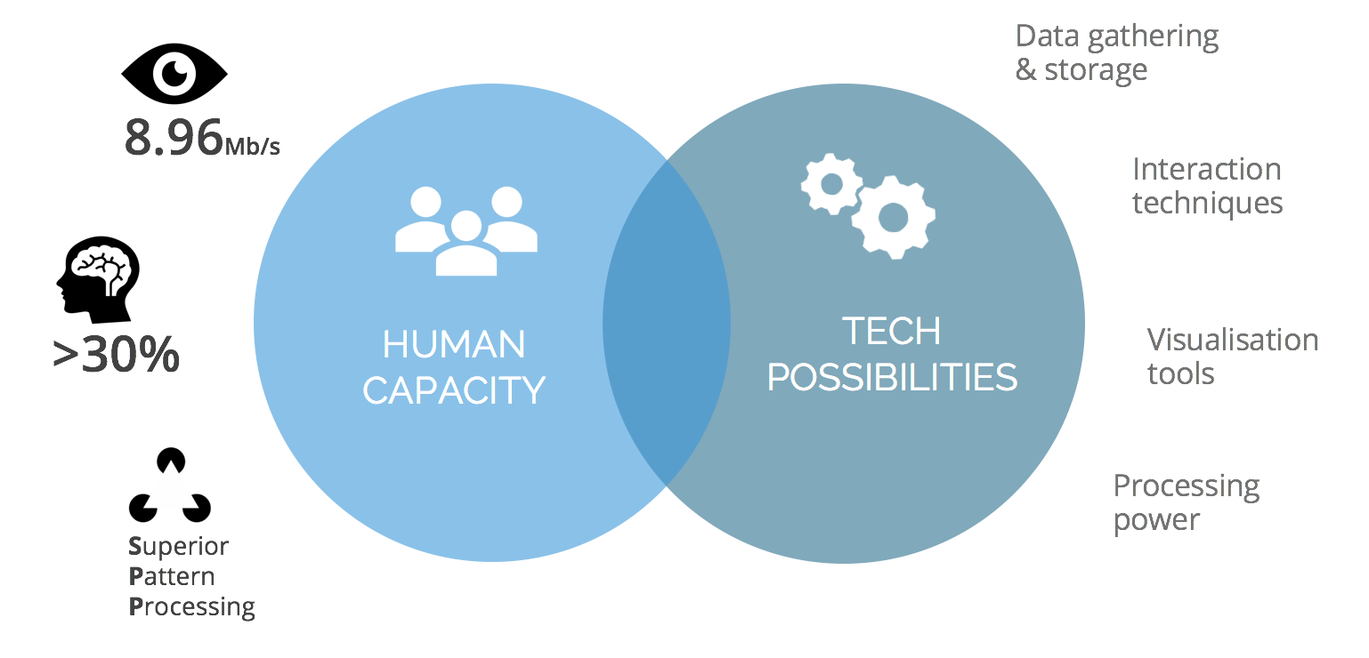
The visual processing capacity of our brain is incredibly powerful:
- Data is transmitted from our eyes to our brains at a rate of around 9Mbps
- More than 30% of the brain is dedicated to visual processing
- When compared to other primates, humans have a greater ability to visually identify and process patterns.
This affinity for visual processing is what makes data visualisations so powerful. However, our brain's processing ability is also limited. Specifically, it's our working memory that is the problem. Just like RAM in a computer, which size is only a fraction of a hard drive's, our working memory is used to store primitive pieces of information for processing. It is tiny - experiment after experiment has shown that, on average, the human brain can hold four different items in its working memory.
Just as an operating system uses RAM, our brain’s way of getting around this limitation is to rapidly swap information in and out of working memory. We use a mechanism called chunking to compress an unwieldy dataset into small nuggets of information that are more memorable and easier to process. This is why we understand a new concept or idea by linking it to another, or find it easier to memorise a phone number by ‘chunking’ digits into groups.
"The process of combining more primitive pieces of information to create something more meaningful is a crucial aspect both of learning and of consciousness and is one of the defining features of human experience."
- Cambridge neuroscientist Daniel Bor
This is why there’s no such thing as a free lunch in data visualisation. To be most effective, data visualisation must provide information at rates that are adjusted to the pace of human thought. Design input is required to break information down into manageable chunks and present it the way that people can process. This applies whether you’re using an off-the-shelf tool or building a custom software solution.
So where do we start?
Understand context
We start in same place as we do when building any type of software. We start by knowing our users.
- Their goals and motivations
- The environment they operate in
- The questions they want to answer, their language and needs
This requires effort by user and the design team, it is a sound investment though. It informs key decisions throughout the design process and successful visualisation is all about making good decisions.
“In order to design a tool, we must make our best efforts to understand the larger social and physical context within which it is intended to function”
- Bill Buxton: Sketching User Experiences
Context matters because your solution design will be fundamentally different when used by a someone in, for example, an office setting, as opposed to a network operations or service management centre.
The concern we often hear our customers voice around this type of research is 'how long will this take, it sounds expensive'. The truth is that user research doesn't have to, and as a matter of fact, shouldn't be huge, nor time-consuming. The best answer to the question: 'how much research should we do', is:' just enough to enable us to move on to the next stage' which is: designing the user journey.
User journey
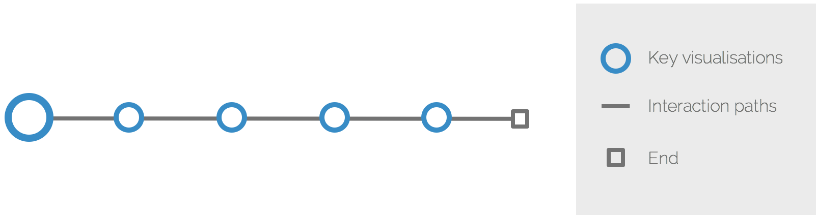
If you compare the experience of the user of your system to a journey of a hero in a story, you will quickly discover that the structure of this story is built upon two main elements: key visualisations, and means of navigating, or journeying, between them: interaction paths.
Some journeys are linear.
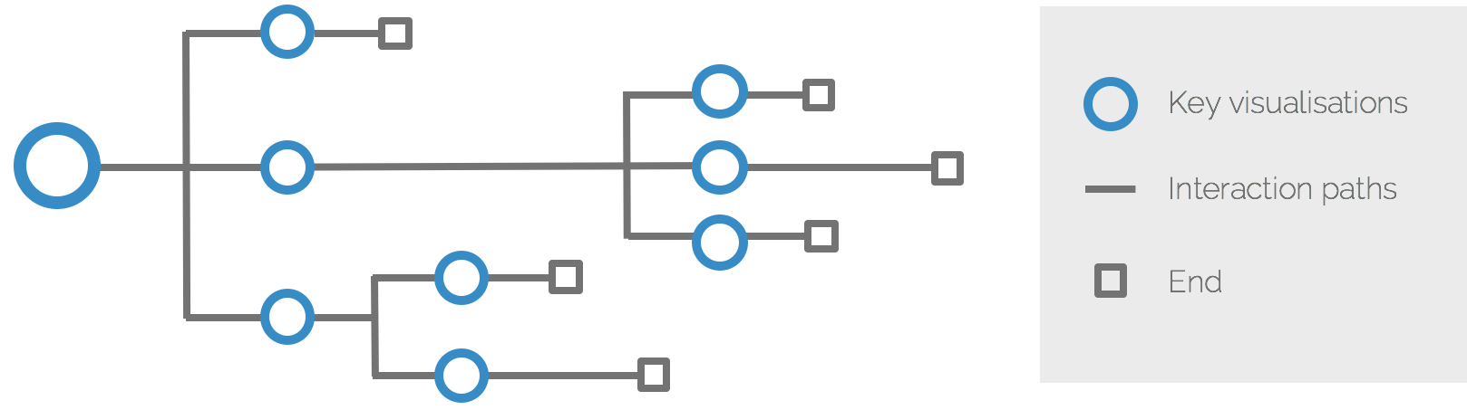
Others are more complex, with multiple branches and navigation paths.
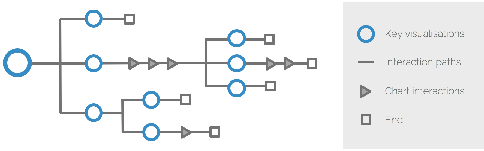
Lastly, the visualisation tools allow rich and sophisticated ways of interacting with the charts: filtering, zooming, highlighting, exporting values, etc. They all help break down information into more manageable chunks so we should account for these too. Bringing it all together, we might arrive at a journey with multiple branching interaction paths and chart interactions.
Key visualisations
Each key visualisation on the journey should be designed to answer a specific business question. Andy Kirk, a data visualisation specialist, proposes applying editorial thinking to help in the design process. It means that you apply an almost journalistic sensibility to uncover the story behind data. Then, you choose the best angle, framing and focus to effectively convey that understanding to the user.
It breaks down into three elements:
- Angle – what are you measuring and along which dimensions are you breaking it down. Angle is formulated by a specific question that the user is trying to find answer to.
- Framing – which data to include and exclude
- Focus – which data to emphasise as more important, while de-emphasising less important parts
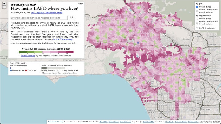
For example, simple heatmap visualisation offers limited user exploration. The angle is quite narrow: 'How fast is emergency response where you live?' In that sense it’s less powerful than providing the user with the raw data but in the sense that it’s accessible to a larger audience it’s more powerful.
An example of more complex visualisation: in this case the angle is broad: 'What’s happening in hospital readmissions?'.

To make the information easier to process, it was split it into multiple charts, each with their own framing and focus. This means more paths for the user to follow and, as a result, explore multiple facets of a problem to gradually build a better picture of a problem. High-level dashboards like this tend to be complex, because the question they’re answering is broad. It is also hugely dependent on the ability of the users what level of complexity they can handle. In this case, the target user is a manager of the medical unit, a highly specialised role. The same dashboard is unlikely to be useful to a nurse working in the same unit.
Interaction is a powerful technique that can be used to break down information for the users. It serves as a glue that connects visualisations without a need to present them all on one screen.
On the example below we provide high-level overview of cell site performance in a geographic region. The angle is ‘how are all sites performing?’. The user has freedom to interact with the visualisation by zooming, panning or selecting a specific cell site.
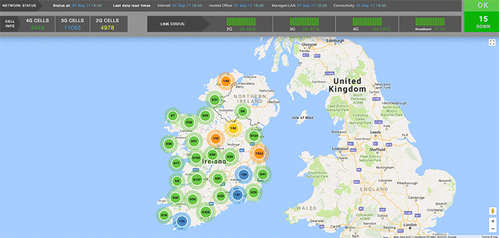
The user can drill down to see more details of the node or backtrack and choose a different visualisation, for example with an angle: 'how are different technologies (2G, 2G, 4G) performing in this network?'
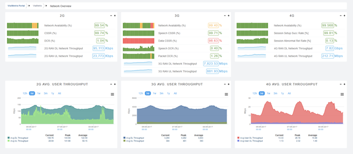
Such guided approach gives the user freedom to explore data from different angles without the risk of getting lost in the data.
Iterate
Poorly designed dashboards can feel like a maze with potentially infinite number of paths, or perhaps the paths are not even that obvious. The challenge for us, as designers, is to identify and decide which paths are most relevant for our users and within the context of their work. Ultimately, we want the users to have a right balance of freedom to explore without letting them get lost or distracted.
Lastly, we need to accept that it's not going to be perfect first time round. Expect to iterate the design. Usage analytics and working with users can help. Over time, new paths and visualisations can be added, or removed. Navigating this ambiguity can be difficult, but this is exactly why we work in small increments. It’s important to retain the balance of flexibility and simplicity while keeping the big picture in mind: always head towards answering the questions that users need to ask of data. In other words, make sure we optimise the solution in the right direction.