POSTED ON 04 MAR 2020
READING TIME: 5 MINUTES
Takeaways from DataViz Live conference
The inaugural DataViz Live was held in London in late February this year, and we hopped on a plane to London to absorb everything we could from the experts.
Described as the “intersection of aesthetics, analytics, and digital transformation”, Data Visualisation (or DataViz for short) is a field that’s growing rapidly - including here at Sonalake. If you’ve ever looked at an uninspiring BI tool or unactionable dashboard, you know what I mean when I say that simply showing data is not the same as DataViz.

The conference was held over 2 days: Day 1 was jam-packed with talks and demos while Day 2 was a full day practical Masterclass. There were three tracks at the conference focusing broadly on Business, Design & Technology (& Tooling). We attended a good mix of talks and want to share some of our learnings with you.
Context is key
We don’t value all data in the same way. What kind of data it is, and how it will be used is fundamental to planning how to visualise it. One distinction I found helpful was between Exploratory and Explanatory DataViz.
- Exploratory DataViz has no inherent message; the user extrapolates the meaning. This is often the case with dashboards - where a user chooses what to explore and how to manipulate the data or relate it to something meaningful.
- Explanatory DataViz is more specific. It’s a visual that has a message or a goal. Sometimes it's a single KPI that incites action, sometimes it’s a presentation or a report where DataViz has been used to convey a message.
Typically, a lot of focus has been given to the former - where the context is about giving the user maximum control over the data - so that they can slice and dice it, compare it, contrast it or analyse it as they choose. But an increasing sentiment in the DataViz world is about the power of communicating your data well - and this is where Explanatory DataViz comes alive with storytelling.
These two types of DataViz are both valuable; one doesn’t replace the other - but it all depends on the context and the audience.
Who’s looking at it?
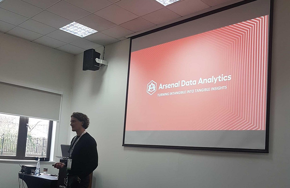
In more than one talk, understanding your user or audience was brought up (this UX designer rejoiced each time!). In Tolly Coburn’s talk about Arsenal FC’s Analytics and DataViz, he mentioned that his team creates reports and even individual visuals based on who will see them. If the reader is more analytically driven, the visuals focus on the numbers and leave out any unnecessary fluff; if the reader is more emotionally driven, the story is more important than the exact data. He also mentioned that knowing where your reader is going to consume the data is key. For example, his managers and coaches are almost never in front of a computer - so his team have optimised all their DataViz reports for distribution on mobile.
DataViz as a communication tool
Data, and the visualisation of it, is not what drives a strategy or makes decisions. But it influences the people who do make decisions. When you can see DataViz as a tool to inform, or help, stakeholders and make their lives easier, you’re likely to do better work and have more impact.
Linked to the points above, your audience and the context that they’ll use your DataViz in will determine the message you want to highlight, or how to present it. In a wonderful showcase by Emma Coch, we saw how a 7ft user journey map with endless pain points, opportunities, anecdotes and dependencies was visualised to show the relative size and severity of the problem - in a simple bubble map along the customer journey.
This meant, that the stakeholders could merely glance a the visual and know where to prioritise their efforts. This visual has a far higher value to stakeholders - who need to make decisions - than showing the entire data set, and is therefore more likely to have any kind of impact.
Less Clutter, More Focus
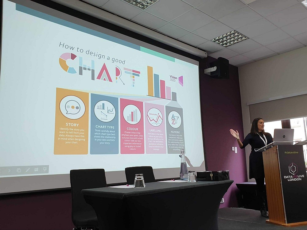
Think a bar chart is as effective as a line chart? Think again. One of the more interesting sessions we attended was by Cole Nussbaumer Knaplic - author of “Storytelling with Data'' and, recently, its pragmatic sidekick “Let’s Practice”.
She showed us a practical example of her 6 steps to great DataViz:
- Understand the Context
- Pick the right visual
- Declutter
- Draw attention
- Think like a designer
- Tell a story
In particular, steps 2-4 were immensely valuable for us because we saw the “before” and “after” visuals of KPIs with a variety of options in every step and could really appreciate how intentional, conscious design can make for clearer data visualisations. We practised this on day 2 during the masterclass with Cole - which is a great way to cement the learnings.
One of the more amusing lessons was to avoid “unicorn vomit” when choosing colours. It’s very tempting to choose a rainbow of colours for data sets but when everything is competing for attention, nothing gets it. It’s more effective to draw attention sparingly and intentionally. In this philosophy, design and data visualisation are similar.
Along the same vein, we were shown how the typical “chrome” of charting often adds unnecessary clutter. When presenting data, it’s a matter of not stopping until there’s nothing left to remove - leaving only the most relevant, most focused data story.
Looking forward
It is clear that there is an appetite for data as a communication tool - it’s not enough to just have a bunch of bar charts - or worse, pie charts - on a screen. Considering the user, their context, the correct representation with an intentional focus - will mean that our clients, users and stakeholders are empowered and informed, and that’s what we strive for.
See you at DataViz Live 2021 !