POSTED ON 23 JUL 2020
READING TIME: 7 MINUTES
Key Takeaways from the 1st virtual DataVizLive
DataVizLive is Europe’s main conference that focuses on exploring the intersection between people, data and technology - the mechanics, the presentation and the leadership. It brings together leaders in Data Visualisation that want to share their passion for creating, delivering and exploring the future of data.
The recent DataVizLive was held entirely online due to Covid and like the rest of the world, they had to quickly learn to do things remotely-first. Although it wasn’t faultless, it was still very engaging. Taking the conference to an online platform was a major help as it combined chat, video meetings and file storage, which proved to be of great support when revisiting the material.
As you may know, Sonalake is an active member of the Analytics Institute of Ireland, which exists to support the Data Science and Analytics sector. In 2019, we won the Emerging Technology Solutions category at the Analytics Institute Fellowship & Industry Awards, recognising the impact of our VisiMetrix solution on transforming data and visual analytics among Telecom Service Providers.
By staying active in the Data Science and Analytics sector, by attending events such as DataVizLive, we can maintain attentiveness to our client’s needs, new industry practices and opportunities to innovate. Now, without further adieu, here are my key takeaways from the event!

Design Guidelines
There was a standout talk by Emma Cosh, a renowned data Visualisation-ist and UX designer with over 15 years experience. Her theme focused on the structures to use when assessing designs. With a focus on the Gestalt principles, some simple yet overlooked measures can enhance designs greatly. Although these principles should be bread & butter for most DataViz designers, Emma uses them to guide her design recommendations and focus on guidelines.
Why should we use Design Guidelines? Guidelines can improve design consistency - something of particular benefit in feature-rich visualisation products, which can ensure the user can understand how it works and learn colour representations.
 Following guidelines can reduce cognitive strain, by not having users learn new representations for every task, it can create an enhanced experience for users. However, this repetition should still come with a ‘spice of variety to keep the user’s interest’.
For designers, it can allow them to make decisions faster and prevent inconsistencies, by looking at what problems have previously been solved (and how). Similarly, developers can use guidelines as a way to reuse components, before the cumbersome task of coding them.
Design guidelines can also improve Brand Recognition. Design guidelines allow for a product's look and feel to become a form of recognition for one’s company, a style that is recognised and that can be appreciated. Better consistency can help build trust and awareness of the product.
Following guidelines can reduce cognitive strain, by not having users learn new representations for every task, it can create an enhanced experience for users. However, this repetition should still come with a ‘spice of variety to keep the user’s interest’.
For designers, it can allow them to make decisions faster and prevent inconsistencies, by looking at what problems have previously been solved (and how). Similarly, developers can use guidelines as a way to reuse components, before the cumbersome task of coding them.
Design guidelines can also improve Brand Recognition. Design guidelines allow for a product's look and feel to become a form of recognition for one’s company, a style that is recognised and that can be appreciated. Better consistency can help build trust and awareness of the product.
Internal Integrity
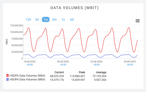
We should consider whether the visualisation contains sufficient information to be understood if removed from the context. This is something very important to consider when dealing with data visualisation software; if someone was to take a screenshot of an analytics dashboard, what would they see? Would they have enough information around the visualisation when removed from its original setting? When offering features such as “chart export”, make sure to work hard at maintaining its Internal Integrity. This can ensure that the visualisations are clear and no misinterpretations being taken from the data.
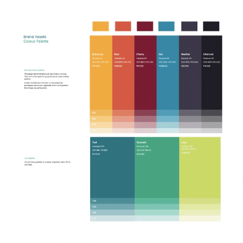
The Meaning of Life Colour
With colours, we want to use them in a way that provides accessibility, in terms of cultural awareness and legibility. I like this colour, but what does it mean? We want to provide representations that are purposeful, consistent and accessible to everyone, while being culturally aware (Blue means ‘go’ in Japan).
 Moreover, we want to create a high contrast between charts and text to assist the user's understanding of the visualisation as a whole. With DataViz, try to utilise a minimum palette with colours that have a strong contrast. Using high contrast in colours and avoiding using complementary hues, can also be of much more benefit for visually impaired users and can still offer strong effective contrasts for decoding the data.
I think we need some space...?!
A great principle that was reinforced from DataVizLive was in the area of spacing. Simple yet effective changes to UI, like using a consistent space between cards and section dividers can go a long way to increasing visual consistency! Why is this important? By applying this, learnability of the product can be made easier due to increased consistency.
 With Preattentive Attributes, we are sensitive when it comes to inconsistencies of lengths and widths and users will notice things ‘even if it is only 5 pixels off’! When designing products where each screen is made up of cards and divided sections, there are plenty of areas in which such inconsistencies can congregate.
Design in Greyscale, Design in Greyscale, Design …
‘Colour should only be used as a secondary dependency and not Primary’. In another standout talk Bridget Cogley discussed the importance of designing in greyscale.
Adding colour last forces a shift to design thinking. This is something other designers I work with constantly reiterate. Senior Designers at Sonalake also testify to the benefits of not allowing the stakeholders to become too attached to the first draft. So, in one fell swoop, both designers and stakeholders can avail by implementing this method.
The Importance of Data Literacy
Another insightful talk was on how to promote data literacy in one’s organisation and allow leaders to see its importance. Sarah Nell-Rodriquez who specialises in strategic customer success at Salesforce argued many fascinating points. A staggering 92% of companies are failing to scale Analytics (Mckinley Analytics, 2018). This talk argued that all companies are ‘data companies’. Why is it so important? Why do we need to be data-driven, and why do we need to be data-literate? Data Literacy is the ability to read, work with, analyse and communicate with data. It is a key building block in creating a data culture. Businesses need to acknowledge and value data skills while recognising their potential. Data literacy means being able to:
- Ask the right questions
- Understand which data is relevant
- Interpret data and knowing if the results are meaningful or useful
- Test hypotheses
- Create easy-to-understand visualisations for decision makers
- Being able to tell a story, to help decision makers see the bigger picture and act on results.
Looking Forward! (Eyes on the Prize)
Delivering powerful DataViz starts with the Internal processes implemented by designers. By focusing on areas such as; Design Guidelines, Internal Integrity and Greyscale Designing, a focus is shifted to design-thinking, as well as the recipient of the visualisations. Moreover, by promoting Data Literacy and allowing a data-driven culture to flourish, businesses can empower themselves by empowering the individuals who work there with this knowledge. Sarah stated ‘we’re in unprecedented times, knowing data is an important skill to have’. The latest edition of DataVizLive (like most events lately) had its obstacles, but overall was a triumph! Although unconventional, it still delivered great content that was appreciated by many. It was filled with informative speakers, who shared expert experience and well-designed visualisations. As Sonalake looks to the future, there must be a persisted focus on the end-users. By adding the lessons we learned at DataVizLive to our toolbox, we can remain focused on always producing relevant, useful and attractive data visualisations.
We’re looking forward to the next DataVizLive!