POSTED ON 06 NOV 2024
READING TIME: 9 MINUTES
Figma Slides

Figma Slides is a great example of Desire Paths
Figma has changed the way that we—and many other design teams worldwide—create, share, and manage User Interface Design assets with colleagues, stakeholders, and clients.
It’s a wonderful tool that relieves much of the stress associated with previous tools (Sketch, Photoshop, Axure) through clever use of cloud technology and collaborative design.
Like any live-service SaaS solution, Figma has made incremental improvements over the years since its launch in September 2016.
Figma has seen remarkable improvements in the past few years, but perhaps the most memorable are new sub-products. How did Figma come up with the idea of FigJam?
Every year, a site called UXtools.co releases its Design Tools Survey results. Of course, Figma has been dominant in the categories you would expect for several years, but in the 2020 results, we start to see Figma overtake Sketch as the most widely used UI tool. We also see a strange phenomenon starting to occur… In response to the question: “Which software do you use for brainstorming and ideation”, Miro was dominant as you would expect, however, Figma was a close second. At the time Figma had not released any whiteboarding tools yet it was edging out competitors whose primary use case was brainstorming (Mural, Milanote).
In 2021, Figma introduced FigJam, a white-boarding tool within Figma that gives users an infinite 2D plane on which to write, draw, and otherwise collaborate with Sticky notes, stickers, cards and diagramming tools, similar to Miro in many ways.
The development of FigJam seems to be a direct response to how users were using Figma organically.
Desire Paths
Described by Robert Macfarlane as “paths & tracks made over time by the wishes & feet of walkers, especially those paths that run contrary to design or planning”; he calls them “free-will ways”.
Have you ever seen a dirt path created by foot traffic that diverges from the constructed footpath? That’s a Desire Path. You can see some fantastic examples on r/desirepaths.

When constructing new buildings for Michigan State University, architects waited for students and faculty to create natural desire paths between buildings and then later paved over those paths creating these organic-looking pathways. Walt Disney had a similar approach when designing the pathways for Disneyland - let visitors decide where they want to walk, then make that the pathway.

This feels familiar to those who practise user-centric design: the concept that every creation should be a collaboration with the end user and that we cannot know everything about how our end users will behave.
Every designer makes presentations
Though it might not be a popular opinion, I think the preparation and presentation of visual slides is a wonderful craft that provides rare opportunities to entertain, engage and inspire. Willing or not, most designers will find that creating presentations is - at least - an occupational necessity. Typically your company will have pre-defined templates in PowerPoint, Keynote or Google Slides.
When we as designers have an opportunity to really ‘wow’ a client - when we want to pull out all the stops and showcase the very best design work - we’ll often start our work in Figma and then (because we’re already there, because it’s easier, and because it makes sense to us) we start the presentation in Figma. Sometimes this is with the intention of eventually adding the presentation to a Google Slide deck, sometimes to simply go through the slides in Figma’s prototype mode.
The problem with this approach is that Figma is not designed for presentations. Most notably, the prototype viewer doesn’t have an option for notes, meaning that presentations are harder to rehearse and if you need to stick to a tight script, the presenter must either memorise the presenter notes, have them open in a separate application, or wing it.
The problem with presentation tools
Presentation software suffers from many problems that designers find frustrating. Here are a few examples:
PowerPoint
PowerPoint is by far the most popular presentation tool owing to its inclusion in Microsoft 365. For most folks, it may be the only option. Though it does boast good integration with other Microsoft product tools like Excel and SharePoint, Microsoft’s Office suite has severe legacy bloat due to its overwhelming popularity across a diverse spectrum of users.
Keynote
Apple’s Keynote tool will make Mac users feel at home, but it suffers from Apple’s classic one-size-fits-all approach to components like the colour picker which hasn’t evolved to meet the needs of brands in the same way that Figma has. The 3D data visualisations were flashy and fresh when they first debuted, but today look cheezy and outdated. Either as a defence against copyright claims or just to be different, Apple also insists on changing shortcuts that almost everyone else has agreed on.
Google Slides
Google Slides is lightweight, fast and reliable. It integrates seamlessly with Google Drive and has a far simpler interface and toolset. Like Keynote and PowerPoint, Google Slides suffers from a lack of pixel-accuracy, forcing users to guess or use ‘tricks’ to ensure consistency across slides. There’s also no way to remove a colour swatch once added or delete a used template.
When designers use these tools it often feels as though design choices are being made for you - that you can never get elements exactly where you want them, and complex diagrams are impractical unless imported as static images. This, in turn, makes maintaining and updating presentations more difficult and time-consuming.
Figma Slides: A Presentation tool for designers
In 2024, Figma announced Figma Slides. Seeing that designers are already creating presentations in Figma, and sensing an opportunity to add another billable service to subscription fees, Figma Slides launched with a set of tools for both Designers and non-designers. They achieve this clear distinction by repurposing the Dev Mode switch into a design mode/slides mode switch.

Design Mode Tools
When you’re in Design Mode, you have tools familiar to designers who use Figma:
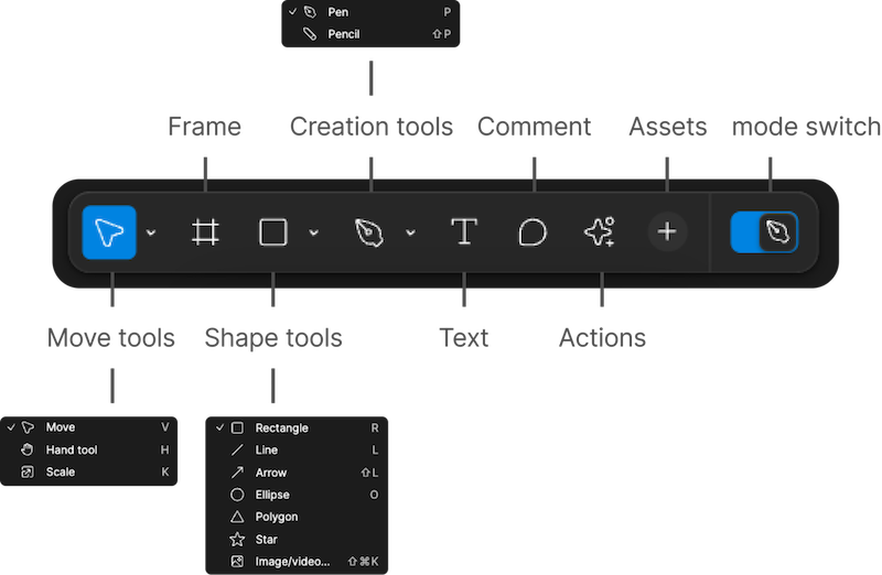
Slide Mode Tools
When you’re in Slides Mode, you’ll have a different set of tools that feel easier to use for folks who might never have used Figma before.
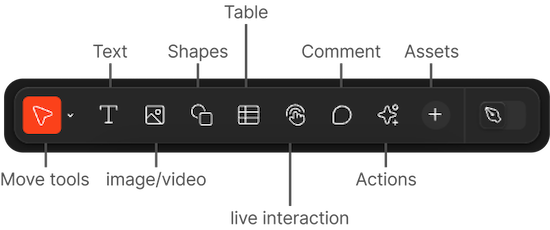
Additional Features
Aside from the typical tools you’d expect in any decent presentation tool, Figma Slides has launched with some interesting extra features that are hard to find elsewhere:
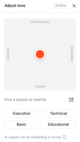
AI Adjust tone
An AI-powered rewriting tool that can adjust the tone of your content. This lets you quickly modify a presentation to target your audience better, such as pivoting a more formal external client presentation into one for internal knowledge sharing among colleagues.
They’ve also recently launched a tool that auto-generates presenter notes based on what text is already on your slides.

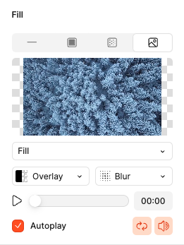
Play video
You can now add mp4 files without requiring them to be hosted. Allows for blurring, colour overlays, autoplay and loop. Although this is offered in most other programs, video combined with other interactive elements provides interesting opportunities for wow-factor presentations.
Auto-layout
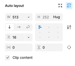
Figma Slides brings their fantastic auto-layout tooling into Slides to help you quickly and automatically rearrange layout components based on rules that you set.
Components
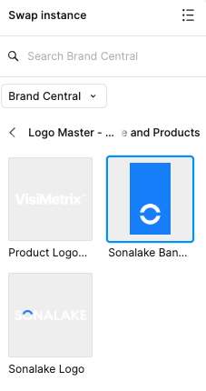
Sync instances of objects across multiple files for faster updates. This means you’ll no longer have to manually make changes to multiple instances of the same diagram or screen - assuming you’ve prepared appropriately by creating a component.
Styles
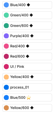
Sync with Design Libraries built in Figma so that your brand colours and typography styles are always at hand. No more eye-dropping from a PNG.
Smart Animate
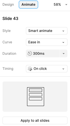
A slide transition toolkit for quickly creating smooth transitions when using the same object on multiple slides. This is similar to tooling found in Keynote and PowerPoint that detects instances of the same object across multiple screens and animates the changes between said instances when changing from one slide to another.
Prototypes in Slides
Figma Slides allows you to stay in presenter view and add in a prototype so you no longer have to messily switch screens when presenting to show off your presentation. I’ve previously seen stakeholders call for a video being added instead of having to do this clumsy switching during high-stakes presentations. No more!
Designers are feeling heard
It’s clear they’ve taken on the feedback from the community and designed a tool that works for a designer’s daily tasks first and foremost - integrating with existing tools and giving us some long-wished-for features in the presentation space.
Developing Figma Slides is not what you’d expect from a company that primarily makes Interface Design - it’s a clear divergence from their primary use case, but they’ve taken the time to look at the daily lives of their customers and solved a problem that perhaps some of them didn’t even know they had.
A paved pathway that still needs improvement
Returning to the analogy of desire paths, Figma Slides is a path that’s only recently been paved. It’s only been publicly available for afew months. There are some glaring omissions and bugs that need to be fixed. The Typography and Colour styling systems are doing things differently to Figma’s Design Tools but don’t seem fully formed yet. While working on a recent presentation, I experienced some minor visual glitches, and it seems to be quite processor- and memory-intensive on my M1 Macbook.
Tools aren’t everything
We’ve spent a lot of time talking about tools here, however, the most critical factor in the success or failure of a presentation is the speaker’s planning, execution and delivery.
It’s storytelling that wins over hearts and minds, not pixels.
If you’re looking to improve your understanding of what it means to create great presentations, I would recommend exploring the resources on the website of Nancy Duarte’s namesake Agency. Duarte is the mastermind behind Al Gore’s famous ‘An Inconvenient Truth’ presentation-turned-film and a true thought leader in the realm of presentations.
If you’re looking to create presentations that you won’t be presenting (Asynchronous presentations), I’d recommend this article by Norman Nielsen Group’s Rachel Krause.