POSTED ON 11 JUL 2018
READING TIME: 7 MINUTES
The evolving landscape of UX tools
The tools we use
At Sonalake we are dedicated to creating great software and user experiences for our clients. We take pride in the quality of our work, so it is only natural that we are deliberate in our choice of tools, methods, and technologies.
In recent years design tools have evolved from their print and early web design roots to encompass prototyping, project management, version control, inline coding, animation and automation. In 2010, Sketch broke the Photoshop mould and set a trend that was soon followed by others, startups and industry giants alike.
![]()
Today, Adobe XD is our tool of choice. XD covers most of the aspects of our design process from wireframing, prototyping, visual design, styleguide creation, through to handoff. There aren’t many tools on the market that offer this ability. For years the designers had to rely on a number of individual products and plugins to support their workflow - the most popular example being Sketch (wireframing, visual design) and InVision (prototyping) combo.
XD started as a small startup within a large company and has evolved through a protracted beta period. It is every product team’s biggest challenge to find the right balance between what the users want and what is the overarching product vision. The primary audience for design tools are, of course, designers. Let’s not forget though, that the designers don’t design for themselves. The success of every design deliverable lies squarely in what it allows us to achieve: visualise, communicate, explore options, drive decisions. The bottom line should always be: what will the client see, will they be able to understand what they see, what questions are they likely to ask, how will they interact with the design deliverable, where is the friction in the process, how might we reduce it? In a way, clients are the end users of XD, or consumers of its outputs. Because of that we are inclined to judge XD based on its ability to enable collaboration with our teams and with clients.
While we are very much aware that no one tool will fit everyone’s needs, we’ve noticed a few areas that are ripe for improvement. Here are some of our observations and suggestions.
Visual Feedback
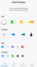
Good interaction design provides feedback. In an online shop scenario, when you add an item to a cart, you expect to see a number appear beside your cart icon which tells you that the interaction was successful. Should the same action take longer to finish, a progress indicator will tell you that the system is still working and thus reduce your uncertainty and prevent you from clicking the same button multiple times. The most basic form of visual feedback happens when you hover over a button (on desktops or laptops). You expect it to respond accordingly, for example by changing colour. It reinforces your guess that the item can be interacted with. It is such a fundamental concept in the User Experience that we almost take it for granted that it will be supported in the design tools we use.
Here is how UXPin allows for basic interactions on elements.

Adobe XD does not support hover effect and, unsurprisingly, it left us looking for workarounds to simulate it. This usually involved extra work and sometimes required that we call on our client’s imagination.
![]()
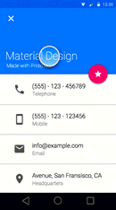
As mentioned earlier, visual feedback can be applied in many different ways but it is always about communicating something to the user: what’s happening, what’s clickable (or not), what did you just do. With a lot of moving parts, this area is complex to manage both on the design and implementation side. Front-end developers refer to it as state management. It basically means that UI is broken down into individual components, like buttons, input fields, navigation items and their state (enabled, disabled, hover, clicked, error, etc.) is managed in a structured way. It’s a concept worth borrowing, which Proto.io, for example, does really well: it supports state management and beautiful element interactions.
The ability to manage state decreases the amount of time a designer needs to spend on developing prototypes. It reduces the number of artboards required to convey design intent.
It also provides an additional level of detail to developers. Are we using simple colour change of the background for hover effect? An animated CSS transition? What colour should we use? The point is, that these conversations need to happen between clients, designers and developers and it’s something that happens without fail in every project, so why not make it easier?
Artboard Navigation
Sometimes tool limitations, for example poor visual feedback support, can be worked around by creating additional artboards. As a result it is not unusual, especially in case of enterprise applications, for a prototype to have over one hundred artboards.
This can create a navigation problem - a problem exacerbated by the fact that artboard titles are not visible on prototype published from XD. No matter how meticulous you are in organising and naming your artboards, all the client sees is your frantic efforts, flicking through the screens trying to find the one you’re searching for.
When presenting a prototype, we must resort to making mental notes of the number of an artboard, so that we can quickly navigate to a particular use case. We have also started developing an index for our prototypes that link to specific use cases of the application to allow for quick navigation but it is a tedious and manual process. What’s frustrating is that all this information (artboard titles and index) is readily available in XD, it is simply hidden in the published prototype.
Artboard Linking
Linking is a way of stitching screens in a desired order, usually to show the progress through a use case. There is no hiding of the fact that when you have over one hundred artboards it can be difficult to manage the links.
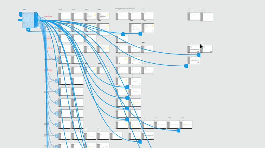
It’s easy to lose track of how many times we have updated a prototype link and discovered that some screens are missing in the prototype mode. More often than not this is due to a previously linked artboard becoming unlinked, essentially a link has been removed from the chain of a use case scenario and too much time is spent trying to find that link. A feature that would allow the designer to see unlinked or orphaned artboards would reduce errors and the amount of time spent on preparing prototypes.
Conclusion
Prototyping is an area that presents a challenge for toolmakers to get right. It reflects directly the fact that the practices around presenting, sharing, and collaborating with clients have evolved hugely in recent years. Long gone are the times where a set of static images were zipped and emailed to clients. It’s so much easier to enable clients to interact with prototypes and collaboratively gather and discuss feedback. We’ve known that for a long time but we had to improvise to make it happen but now our tools make it possible.
Of course, solving one problem opens a whole new set of challenges: how far do you push prototype’s interactivity, how should you deal with huge sets of artboards, how might you minimise the amount of rework the designer has to do to implement changes?
Adobe has had a dominant position in the creative industry for decades but with ambitious startups like Figma and bold moves from companies such as InVision we are likely to see things change. One thing is certain - the landscape of UX design tools is constantly expanding and evolving to better match our workflow and we’re excited to be part of this journey.