POSTED ON 28 SEP 2023
READING TIME: 5 MINUTES
Canvases and Frameworks: When design is not design


One of the most important aspects of design involves the creation of artifacts that will never be seen by an end-user and will never be shown on the cover of a portfolio or be lauded for their beauty or style. I am talking about canvases, a collection of mechanisms by which designers organise their thoughts into two-dimensional maps to help stakeholders, colleagues and themselves understand their logical processes.-
Canvases come in many shapes and sizes and are used for many things. The most common manifestation of a canvas might be a mind map. User Experience Design, in its short history as a mainstream profession, has created an ordinant collection of these tools to help designers work beyond the pixel.
Today, I will share three canvases that I find helpful in almost every project I'm involved in.
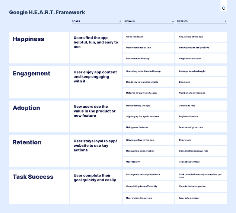
1. The Google H.E.A.R.T. Framework
This is a framework to help you organise your metrics into tangible outcomes. H.E.A.R.T. stands for happiness, engagement, adoption, retention, and task success.
This framework is a very neat pyramid structure that helps you, as the designer, understand which metrics you should be using and the underlying value each of these metrics provides.
Let's look at one example of these metrics:
Within "Happiness", the goal is that users find the app helpful, fun and easy to use. How do you know that you've done that? When you have signals like good feedback, perceived ease of use, and users recommending the app to others. How would one find those three signals in the most practical sense? Well, if your app is a retail app published in a store, your store will provide an average rating, assuming that it's a 1 to 5-star rating; having a rating of four or five stars after a reasonable amount of reviews would point you to a measurable 'good feedback' signal.
Each of the 15 metrics embedded in the H.E.A.R.T framework has an associated signal or a goal they are trying to achieve, and all associate back to one of the five letters in the heart acronym.
The H.E.A.R.T. Framework works best when paired with best-practice user testing and analytics to accurately measure the underlying metrics.
2. UX Testing Plan Canvas
Undoubtedly inspired by the business model canvas made famous by I.D.E.O., the UX testing Plan Canvas developed by Userfocus is a powerful tool to help you check that you have thought of almost everything before starting your UX test. Filling in the various boxes with answers to the questions helps you prove to yourself and stakeholders that you thought of every practical aspect of how the tests will work and what benefit they will provide.
The questions posed are:
Product Description
- What's being tested?
- What are the business and experience goals of the product?
Business Case
- Why are we doing this test?
- What are the benefits?
- What are the risks of not testing?
Test Objectives
- What are the goals of the usability test?
- What specific questions will be answered?
- What hypotheses will be tested?
Participants
- How many participants will be recruited?
- What are their key characteristics?
Equipment
- What equipment is required?
- How will you record the data?
Tasks
- What are the test tasks?
Key Results
What is the measure of success?
Responsibilities
- Who is involved in the test, and what are their responsibilities?
Location & Dates
- Where and when will the test take place?
- When and how will the results be shared?
Having answered all of these questions concisely enough that each answer fits in each box, you and your team can be assured that you're on the right track to having a successful user testing experience.

3. The Value Proposition Canvas
Initially developed by Dr. Alexander Osterwalder as a companion to the Business Model Canvas, the Value Proposition Canvas is organised in such a way as to show the customer and product/service in clear and relatable contrast.
On the left, you have a square representing your product:
- Features (products and services)
- Gain creators (how the product/service creates unexpected delight for customers)
- Pain relievers (how the product/service helps solve existing problems for customers).
On the right is a circle representing the customer. This circle is often filled out with insights from initial pre-production user interviews where a customer describes:
- Their gains: what they would expect or need of a product.
- Their pains: the problems they currently have in their status-quo situation, whether that be with a current version of your product, a competing solution, or with no solution at all
- Customer jobs - the functional, emotional and social tasks they try to perform. These statements are usually the most fundamental requirements: "I need an XYZ I can rely on" or "I don't want to have to think about XYZ."
With a fully fleshed-out Value Proposition Canvas, it is easy to make direct connections between your customers' needs and your product's features. If such links are few and far between, it might be worth considering whether your product fits the purpose or is targeting the right kind of customer.

There are many, many more types of canvases and frameworks in the world of UX, but with this small taste of non-design design artefacts, we hope we've inspired you to go out and explore this wonderful world of putting ideas on paper to make customer's lives that tiny bit better.
Sonalake has an experienced, robust design team well versed in User Experience Design best practices. Talk to us today about your project: email hello@sonalake.com