POSTED ON 10 OCT 2019
READING TIME: 9 MINUTES
Battle of the pixels: how we chose a new design tool
Here at Sonalake we frequently review and update the way we work to match the evolving needs of our clients and emerging industry standards. Recently we had experienced some frustration with our go-to design tool, Adobe XD. Our team has grown, the sorts of work we’re doing has shifted and despite only using it for 2 years, our needs have changed - we need a tool that allows for better collaboration; both between multiple designers as well as with the broader team, and so it was time to evaluate our options. In this article, I’m going to take you through our journey of assessing and choosing our new design tool. I’ll also tell you how it has already improved our design process.
Creating and collaborating
Product design is not limited to placing pixels on a screen. While that is a crucial function, there’s more to it than that, and it often requires the use of many different tools for a variety of tasks. There are a bunch of typical steps, including workshops, wireframes, UI mockups, and prototypes. We produce many artefacts and sharing them with clients is one part of the job, but testing them with users and handing them over for development is also part of the journey.
Traditionally, design tools focused on being able to “create” things. Designers would create shapes, add colour etc. Typically, the exports of these tools were Vectors - images, or slices of images that could then be coded around. This started changing when CSS was introduced. No longer did developers need images, but they needed values, like the Hex value of a colour or the specific size, type and fonts used in the copy.
Most design tools are adequate at the “create stuff” aspect. Not a huge amount has changed in that space for a while. But what has changed are tools that deal with the rest of the steps:
- Prototyping
- Testing
- Hand-off
- Version Control & Asset Management
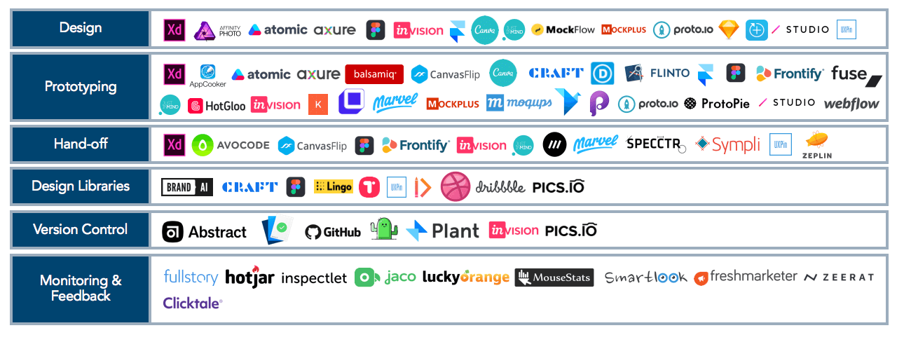
Courtesy of Scale Venture Partners: [https://www.scalevp.com/blog/design-in-the-enterprise](https://www.scalevp.com/blog/design-in-the-enterprise)
For each task in the design, there are countless tools. And within the industry, there is a lot of competition. Not all design tools are relevant for each kind of team though, and we were looking for a tool that did more than our current one.
One of the biggest gaps we face is Hand-off - where we handover the designs to the developers who will bring them to life. Over the years this process has become less manual - products were introduced to handle this. The most famous is Zeplin, which “reads” the designs and outputs the values. But the problem is that it’s another tool, which means another licence.
Another requirement is the need to manage design libraries and account for version control. This is a challenge that developers solved ages ago, by using Git - which is a way of merging different streams of code into the same base.
As products grew, so did design teams and the software couldn’t always keep up. When teams of even 2 are working on the same project, managing the “latest” can be tough: having loads of versioned files, and needing to keep track of many changes to many elements and components can be a full time job.
Thankfully, tools started coming out to manage this. The most well known is Abstract but, again, it’s separate and requires another licence.
We found ourselves in a spot where we wanted software that helped with the gaps, but preferably didn’t want to have 3-4 tools to deal with a design flow.
“I’ll just leave this with you”
We started off by narrowing it down to the 6 we thought showed the most promise - either because they’re popular or because they’re well funded.

Then we looked at their respective functionality. Looking at this, you’d think that Sketch is the least useful. It’s not - in fact it’s the most popular tool out there, but where it falls short is that it’s not an all-in-one tool. Rather it works with other tools (like Zeplin and Abstract) while it’s slowly growing into an all-in-one. It also doesn’t support Windows.
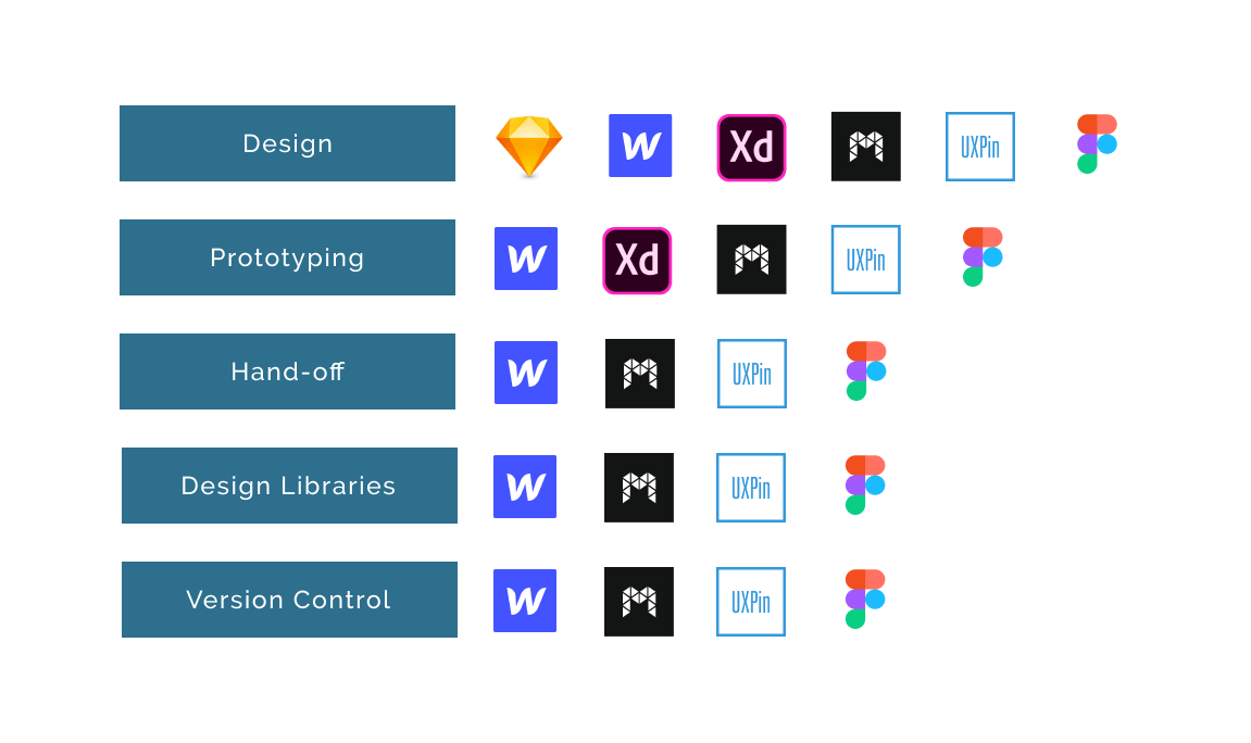
Noticeably, XD deals with Design as well as Prototyping. But where it falls short is that most other tools - including ones that deal with version control or handoff don’t support XD files. This is a major downside to XD, and it’s not their fault. XD is expensive though, and that is always a consideration.
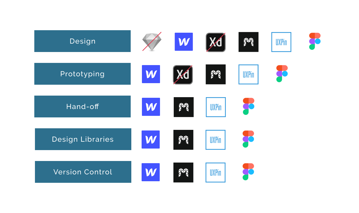
So we knocked Sketch and XD off the list early. We then knocked Modulz off, because it’s not available yet. They’re only going into open Beta now and we needed a tool sooner rather than later.
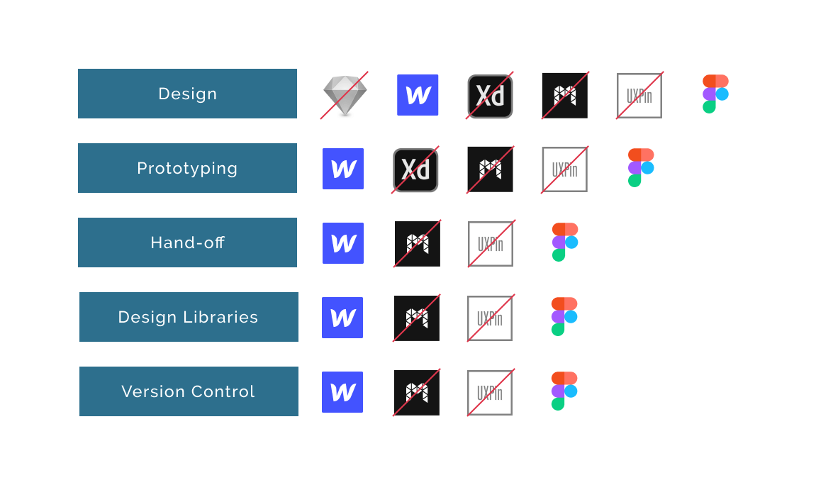
The final showdown
Finally, we knocked UXpin out. While, in theory, it offered all the functionality we needed, it didn’t “feel right”. It had weird navigation and didn’t work in the same way as other design tools. So because of that, we are left with just two: Webflow and Figma.
The biggest difference between them is that Figma is a more traditional Design Tool, while Webflow is a visual code editor. Webflow sells itself as a way to develop code, but using design software. It exports code rather than vectors or images. Figma is more traditional. But what it sells is the ability for collaboration and design system management.
So I set myself a test to see which would yield the best results. I went for something fairly simple - redesigning Sonalake’s home page.
On Webflow, I spent the better part of a week watching tutorials, thinking that I’ve totally got this. And... mustered up about half a page worth of content. Honestly, it kicked my butt. Because it mimics the structure and features of HTML and CSS, it was difficult to pick up as a designer.
This tool seems more suitable for people who already have a foundation in front-end development. Even with a decent understanding of code structure, the metaphor on which it is based is too far of a jump for me. I’d be interested in continuing to improve my use of the tool, but it doesn’t come close to the speed and ease I need everyday.
And the winner is…
I then moved to Figma and got out a full homepage within half a day, including some time for basic onboarding and exploring. So in that sense, because of the comfort of “knowing” the tool and the speed at which I could work, it was the clear winner.

But there are some cool things within Figma that also contributed to the decision. Multiple people can work on the same files at the same time. That doesn’t sound super useful, but often design files get pretty large and multiple screens are involved. So sharing the load, traditionally, was very difficult. We’d have to create copies of files, and then copy over the work into a Master file. Sharing the latest components or elements between distributed files is a massive pain, and is one of the reasons we wanted to explore new tools to begin with.
The other big feature is that you can create and share design libraries for the team. This means that not only can we work on the same files, but we can create multiple files for different projects that share a library - useful when you have multiple projects for the same client.
In Figma, you can just directly add a component to the Team Library and that becomes the source. So if you change the component in the library, it updates everywhere. Equally, because it’s a separate file, it makes managing the design system easier. This has removed the need for an extra tool like Abstract.
As a company that works with different clients and multiple projects within each client, the hierarchy that Figma uses matches ours entirely. Within a Company, you can set up teams and projects. Within Projects, you can create multiple files as well as a Design System. So, you’re not just creating one design system for your team, but multiple design systems. This is exactly what we need.
So far, Figma has been a great tool for Sonalake. For projects both client-based as well as internal, we have been able to socialise the design work far more widely. All stakeholders/clients now have access to the relevant files, and because of the permission levels, can comment or ask questions where necessary. It also means that the files are only in the hands of the designers ;)
No silver bullet
The UI Development team are happy with it - the details they need are there, including spacing and size values alongside the usual colours and fonts. This has already reduced the need for extra tools, like Zeplin, which would also have previously needed updating and maintaining. At the same time the product owners can export the latest directly from the tool to share with other stakeholders, or just make comments on the work. This has made communication easier since we’re always talking about the same version.
No tool is perfect, and there are two noticeable downsides to Figma. The first is that the prototyping features are very basic - it only caters for basic click throughs which means to show a flow with many microinteractions or states, you have to duplicate entire pages and make changes (as opposed to UX Pin, where the layers of interactivity are separate from the main artboard).
The other con is that it is very heavy on memory and CPU. This may make large, complex projects tricky to manage, and we may need to find ways to mitigate that.
There are loads of features and tricks that we will need to still learn and a roadmap of updates to come, but so far Figma has ticked all the boxes for us because of how it has simplified our process and made collaboration simple.